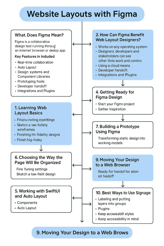
Figma is a program where people can design user interfaces, create prototypes, and work together. While you can use Adobe XD or Sketch like traditional programs on your computer, Figma runs through your internet browser or as a desktop app. Many people can work on the same design file at the same time, in a similar way that Google Docs works.
- 2. How Can Figma Benefit Web Layout Designers?
- 3. Learning Web Layout Basics
- 4. Getting Ready for Figma Design
- 5. Choosing the way the page will be organized
- 6. Working with SwiftUI and Auto Layout
- 7. Building a prototype using Figma
- 8. Teamwork and Give and Take
- 9. Moving Your Design to a Web Browser
- 10. Best Ways to Use Signage
- Conclusion
Key Features:
- Real-time collaboration
- Auto Layout
- Sometimes it depends on Design Systems and Component Libraries.
- Prototyping tools
- Developer handoff
- Integrations and Plugins
2. How Can Figma Benefit Web Layout Designers?
There are several good reasons why Figma is perfect for website layout design:
- It works on any operating system.
- Designers, developers, and stakeholders can see each other’s work and comment in real time.
- Using the cloud means you don’t have to handle separate versions of files locally.
- Manage and bring together your code and design assets using design systems.
- Figma makes the design and development process work well together, allowing everything to happen faster and with more teamwork.

3. Learning Web Layout Basics
It’s useful to know some basic principles of layout when you begin with Figma.
Grids and Columns
Grids guide you to place content neatly and help your website look well-organized. Most responsive designs use a 12-column grid as their default.
Visual Hierarchy
Choose your typography, its size, color, and the layout to lead the user through your design.
Whitespace
Having extra space around the details makes things easier to notice and improves how easy the design is to read.
Responsive Design
Design your website so it works well on mobile, tablet, and computer screens.
The area you see when a site loads without scrolling.
What is most important should always be visible without needing to scroll.
4. Getting Ready for Figma Design
Start Your Figma Project
Launch a new File: You’ll begin on an empty canvas.
Page designs by flow or type of device (such as Mobile or Desktop).
Frame each screen for your app using their specific sizes: 1440px on the desktop and 375px on mobile.
Choose the framework of your design system.
Pick colors based on your main, supporting, and neutral groups.
Set the appearance of your heading styles, the text you use for bodies, and your buttons.
Design your grid using 12 columns and a 1200px container.
Gather Inspiration
Build examples or make mood boards to help you make the right design calls.
5. Choosing the way the page will be organized
After fine-tuning your settings, you can start designing your content.
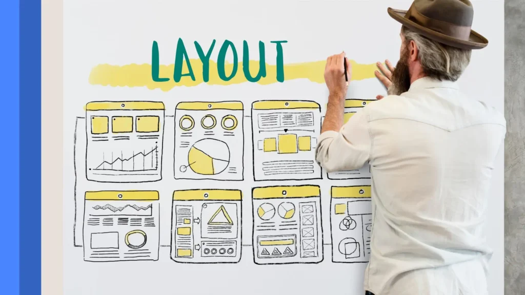
Sketch the website.
To begin, use low-fidelity wireframes and visualize your site’s structure. Make sure the structure of your page is clear, not the colors or graphics.

Important Sections to Add in Your Package:
- Header with (logo and menu)
- Hero Section
- Features/Services
- Testimonials
- A CTA is a section that tells users what to do next.
- Footer
- Finish the High-Fidelity Design
- Use real visuals instead of wireframes in your design.
- Choose colors and lettering
- Embed pictures and symbols into your site.
- Always use padding and spacing in your designs similarly.
- Use Figma’s Layout Grid as a guide when you work.
- Show layout grids when you are working on your frames.
- Press the frame on the LCD monitor.
- On the right side of the panel, you will see Layout Grid. Click on it.
- Under “Columns,” set the gutter as well as the margin width.
- Doing this allows your design to follow a pattern and be quickly put into practice.
6. Working with SwiftUI and Auto Layout
Components
- Create components instead of buttons, nav bars, and cards.
- Pick the element
- You can find the button to create a component in the menu by clicking “Create Component” or pressing Cmd/Ctrl + Alt +
- Assets are now available in all spaces and can be updated worldwide.
Auto Layout
- Thanks to Auto Layout, responsive design is now simpler.
- Let Auto Layout handle the layouts of buttons, cards, or sections.
- Check how much padding, where that padding is, and how far apart the objects are.
- Elements change in size on their own depending on what is included.
- When creating containers, navbars, and modal dialogs, apply Auto Layout instead of fixed sizes.
7. Building a prototype using Figma
Change your static design into a working model.
How to Make a Prototype:
Visit the “Prototype” page
Take a connector and move it from one page to another.
Choose whether the event occurs on a click or a hover
Discuss the three main types of animations in After Effects: Instant, Dissolve, and Slide In
Make models of user experiences to experiment with them, like:
Going from one page to the next
Opening modals
Buttons in the design with hover effects
It is possible to report these findings straight to stakeholders or clients.

8. Teamwork and Give and Take
Collaborating in real time with others is one of Figma’s greatest strengths.
Sending or Delivering Your File
View the Share button and click on it.
Allow access only to what a person needs (Can View / Can Edit)
Send the information to your team.
Comments
Leave your comments using the “Comment” feature
Answer or respond to people’s comments instantly
Emails and screenshots are not needed with Figma.
9. Moving Your Design to a Web Browser
As soon as your layout is approved, you need to get ready for the development stage.
Inspect Tool
- Developers can click on things in the design to check their properties.
- CSS code
- Dimensions
- Fonts and colors
- Export Assets
- Decide which element you’d like.
- Choose to export in PNG, SVG, or JPG mode.
- Download the links for each product or share them with your friends
- If you’d like, use plugins like Zeplin or Figma’s Dev Mode to help with easy design handoffs.
10. Best Ways to Use Signage
Labeling and putting layers into groups
It is important to have the same name consistently used for buttons such as Logo or Primary.
Organize your headings so that the most important is at the top and the least important is at the end.
Use Plugins
Among popular plugins, you find:
Unsplash: Use stock images in your WordPress site.
Fake data or text is what should fill the Content Reel.
Select thousands of icons available in Iconify.
Make Styles That Can Be Reused
Apply Text and Color Styles to your pages
Update the site across the world as needed.
Keep Accessibility in Mind When Creating Design
Keep colors viable for those with color blindness.
Start your headings with what is most important and end with what is least important.
Ensure users can focus on elements and use the keyboard while navigating your website.
Conclusion
Designers use Figma to make and share website layouts in a modern way. Ideation, prototyping, and handoff are all made easy for creating websites that are both user-friendly and pleasant to use with Figma.
Applying the basics of layout and using Figma’s tools for making components, auto layout, and prototyping helps you save effort, boost cooperation, and achieve precise designs in less time.
You reach mastery in anything through repeated practice. Don’t worry; begin with little projects, look at Figma’s community resources for guidance, and keep making changes. Figma is the best tool to use for designing anything from a small landing page to a complicated web app.


